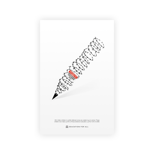

ROLE Concept, Poster, Graphic
DURATION February – March 2015
How do you design an effective event poster?
This project was designed for my New Media Design Elements I course, with the goal being to use visual hierarchy to design an effective poster. The information was based upon a prior typographer research and presentation project.
01 Process
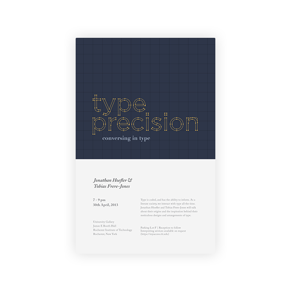
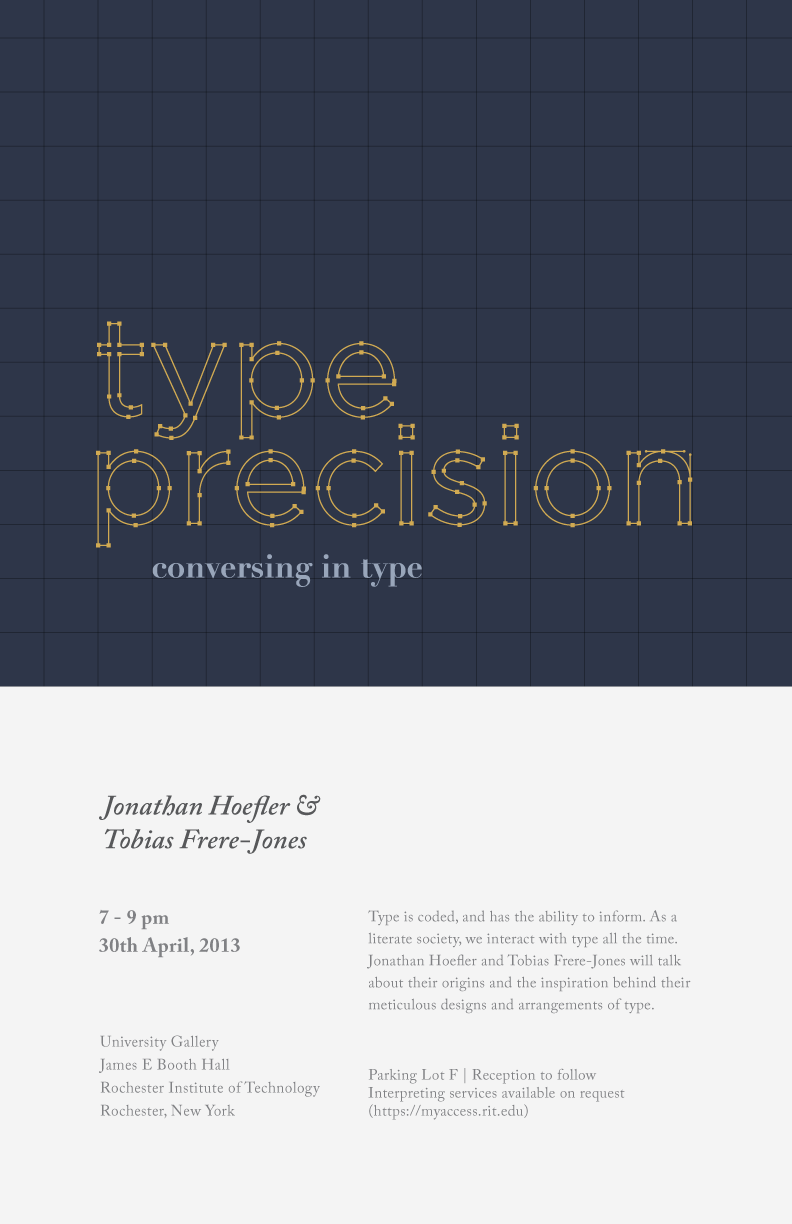
The prompt was to present on a graphic designer or typographer of choice. I chose to present on Jonathan Hoefler and Tobias Frere-Jones, both of whom are very recognised figures in the realm of typography. The presentation, which discussed their influence, lent itself to the poster design.
The design went through many stages. Because I had two designers who (once) worked in conjunction with one another, I had initially hoped to combine the letters of their names in order to create a nice graphic to pair with the poster copy.
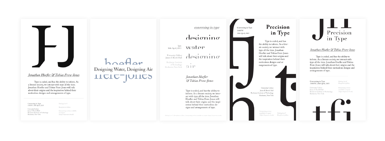
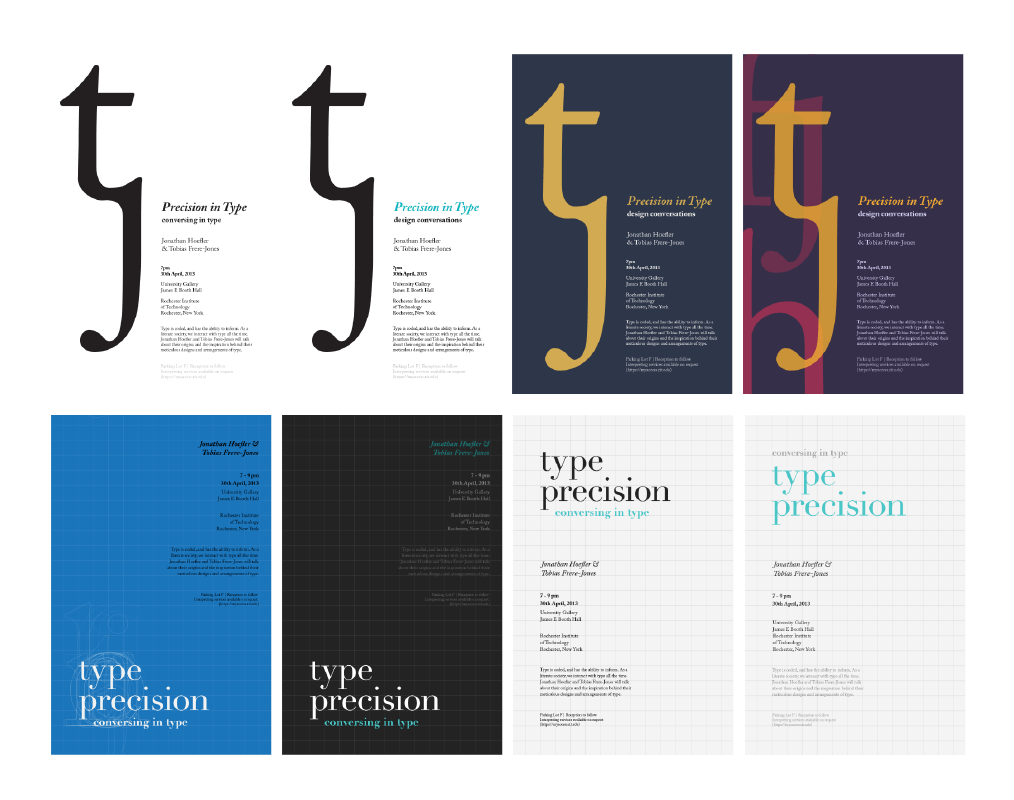
Eventually, however, I decided that the direction I was going in wasn't exciting or attention-catching. I thought about typography and the process of creating a typeface - the idea of conforming to a grid, and the act of adjusting an expanded typeface in Illustrator.
02 Posters
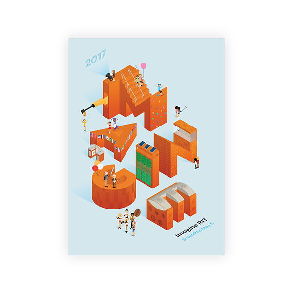
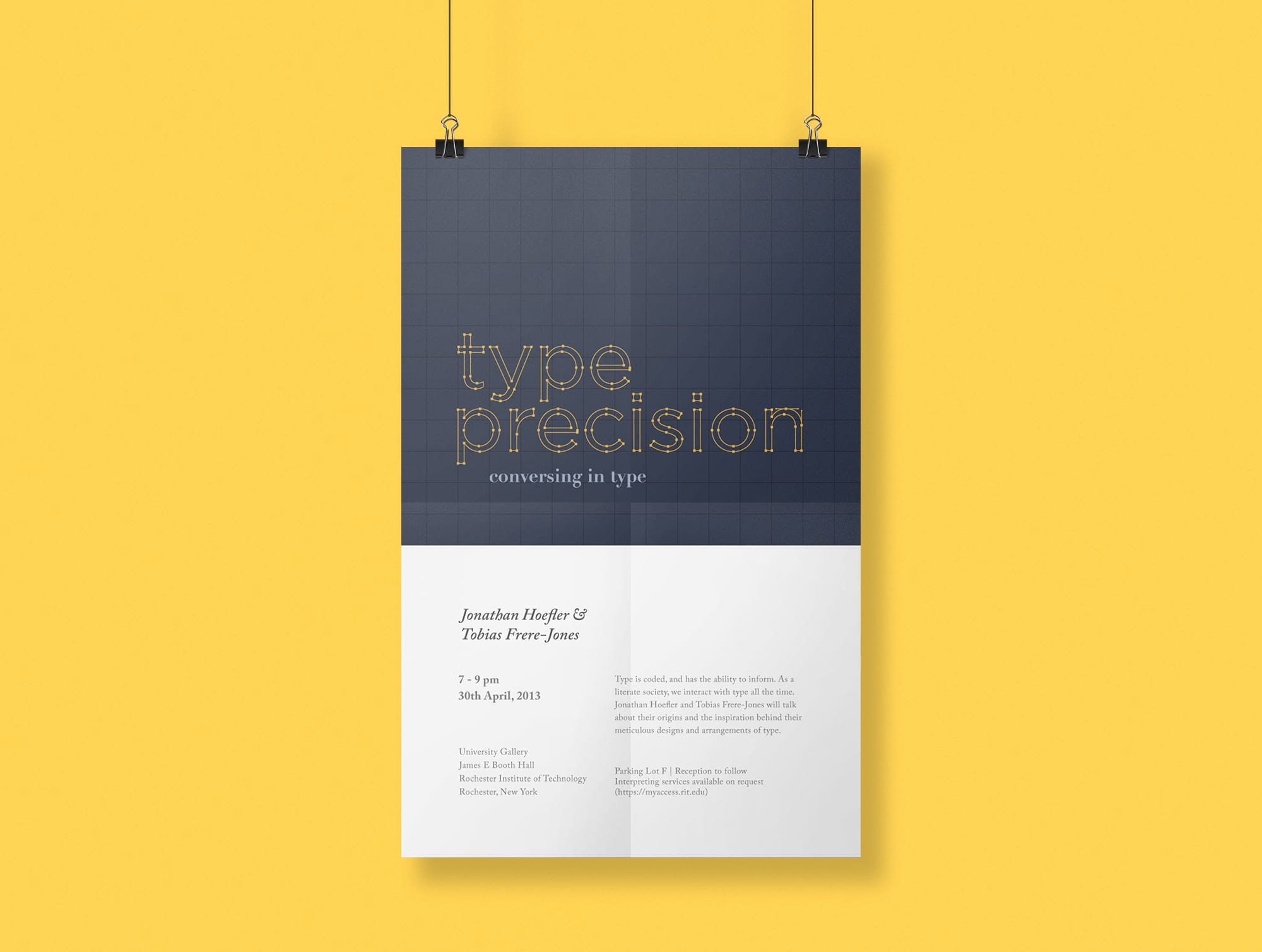
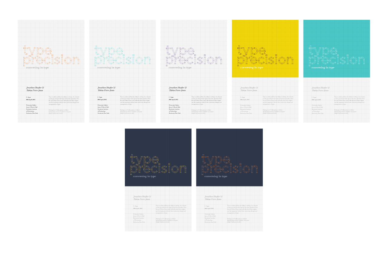
After a lot of tinkering, I found a visual style that I liked - grids, but played down, and important areas highlighted using colour blocking. Details such as the nodes and handles of the header type give the design personality and a unique quality.
ITERATIONS
FINAL POSTER

03 Fin
When it comes to events and event posters, our attention must be captured right away. This is possible with the right balance of visuals and body copy.
But wait – there's more!
Are you looking for a designer who hustles hard but stays humble? A curious soul who bobs her head to the Beatles and EDM? A foodie who will venture out for amazing cuisine with you?  If so, do get in touch!


© ETHELIA LUNG