
ROLE Concept, Visual, Motion
DURATION September – December 2017
The invisible poor are referred to as invisible for a reason.
Most of us are unaware of the portion of civilisation that lives below the poverty line, and much less so in many major cities because of our perceptions of their affluence. I want to bring awareness to the extent of invisible abject poverty in global major cities, by allowing users to think about this issue through objective and emotional lenses.
00 Purpose
Growing up in the affluent society that Hong Kong is, I was always very aware of the ridiculous wealth gap in the city; when talking about Hong Kong, however, most people associate it with being solely a vibrant international hub. I wanted to not only highlight some of the underlying social issues of my city to my peers, but also bring awareness to the issues prevalent in all major cities around the globe.
Questions
Is it more impactful to present users with story-based data for emotional impact?
What will the stories consist of?
How can I incentivise people to care about the issue at hand?
Understanding
To thoroughly understand my problem space, I looked into the definitions of different types of poverty as stated by UNESCO and the United Nations Development Programme, sources for quantitative data on income and poverty statistics such censuses, and case study stories through many global news publications.
To concisely and accurately communicate the message, I looked at resources such as Tipping Point's Poverty Line Prices, a resonating lesson on relativity, Ekene Ijeoma's The Refugee Project, a clean and meaningful interactive timeline of the global refugee crisis, and UNESCO's Out-of-School Children, a tonally and thematically appropriate illustration of the state of children's education around the globe.
01 Approach
In order to have a wider and more flexible reach, I want this experience to live on the web, accessible on desktop, tablet, (possibly) phone, and any larger interactive screens.
The focus of the infographic
is on the narrative told.
I want users to have is a sense of urgency to contribute to the conversation, by showing the resources and programmes that exist to address such problems. I will use the following to portray these poverty case studies –
Objectivity
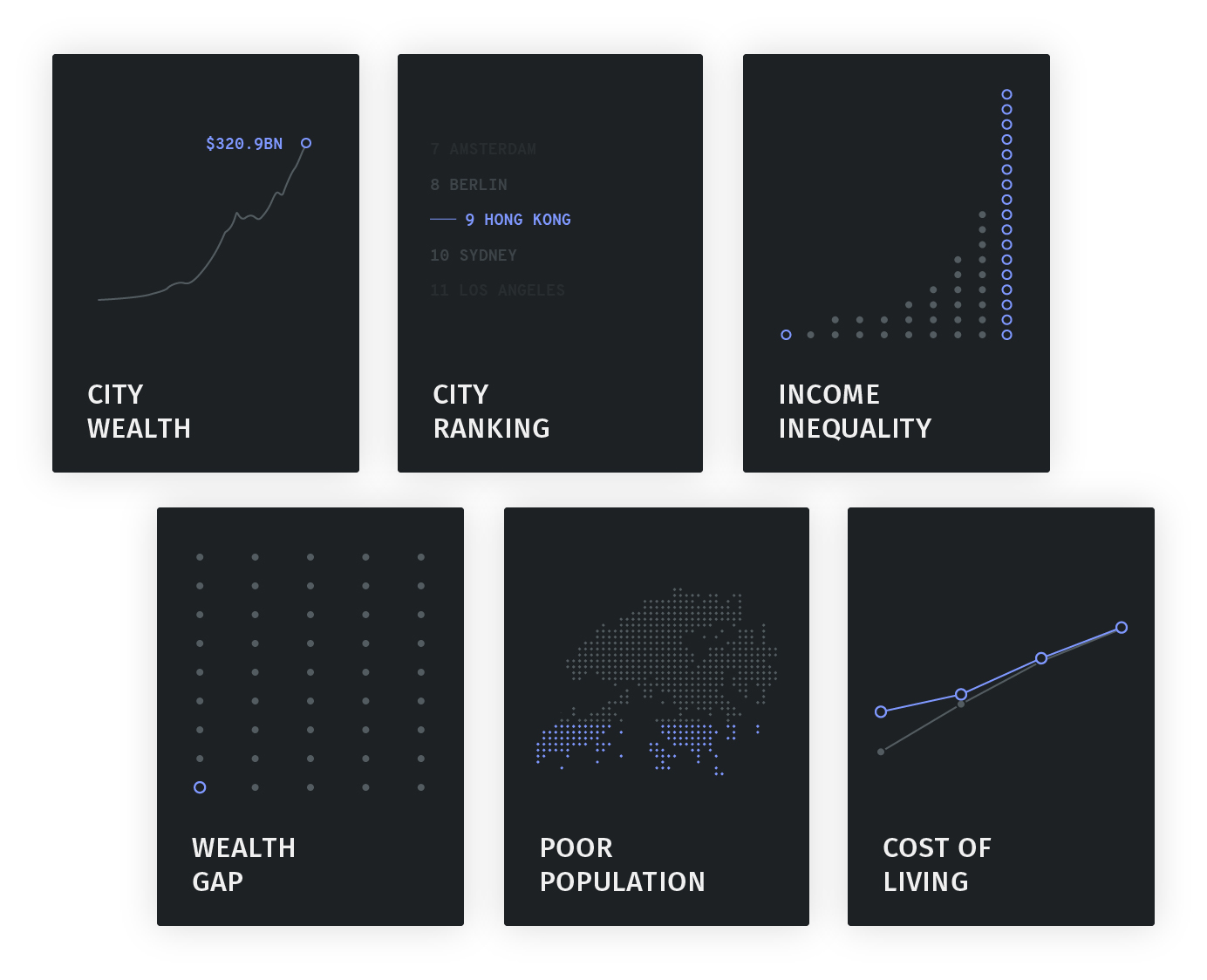
Providing users with quantitative data on indicators of poverty, using indices such as:
GLOBAL POWER CITY INDEX (GPCI)
Evaluates the comprehensive power of leading cities according to economy, research and development, cultural interaction, livability, environment, and accessibility.
POVERTY RATE
The number of people in a given group whose income falls below the poverty line.
POVERTY LINE
The estimated minimum level of income required for basic life necessities. Not to be equated with the basic cost of living.
GINI COEFFICIENT
A statistical measure of the degree of variation or inequality represented in a set of values, used to measure income inequality. A number in between 0 and 1, the higher the coefficient, the higher the income inequality.
Subjectivity
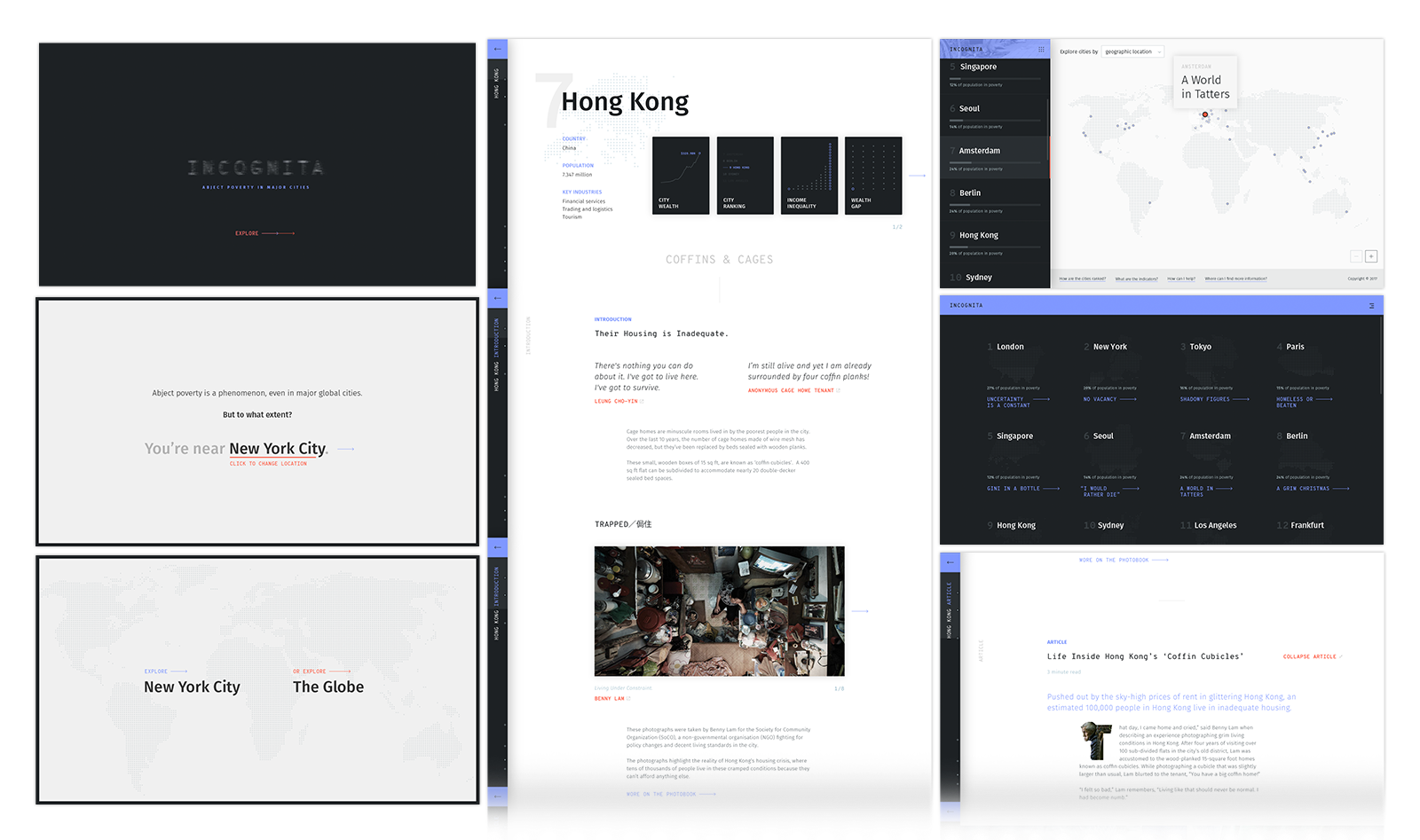
Telling a narrative of abject poverty in context, through case studies that give context and dive into personal stories of manifestations of poverty. I chose Hong Kong's phenomenon of coffin and caged homes in demonstration.
Delight
I also want to attract and engage user interest through the use of strategic and pleasing microanimations. This subject is heavy, so the tone should reflect a balance between sombre and lighthearted.
02 Design
Although initially a dark theme with hints of accent colours, intended to be an illumination on the issue, such a theme would be tonally inappropriate. Rather, I wanted to cast a lighter yet at the same time sincere and honest tone on the issue.
03 Solution
Keeping the narrative in mind, I designed the experience with two key aspects in mind: the objective, and the subjective. This includes considering how statistical data should be represented (the infographic portion), how the stories should be represented (the case study portion), and how both these aspects should be accessed. I separated out all these considerations into sections accordingly.

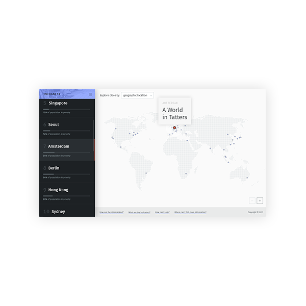
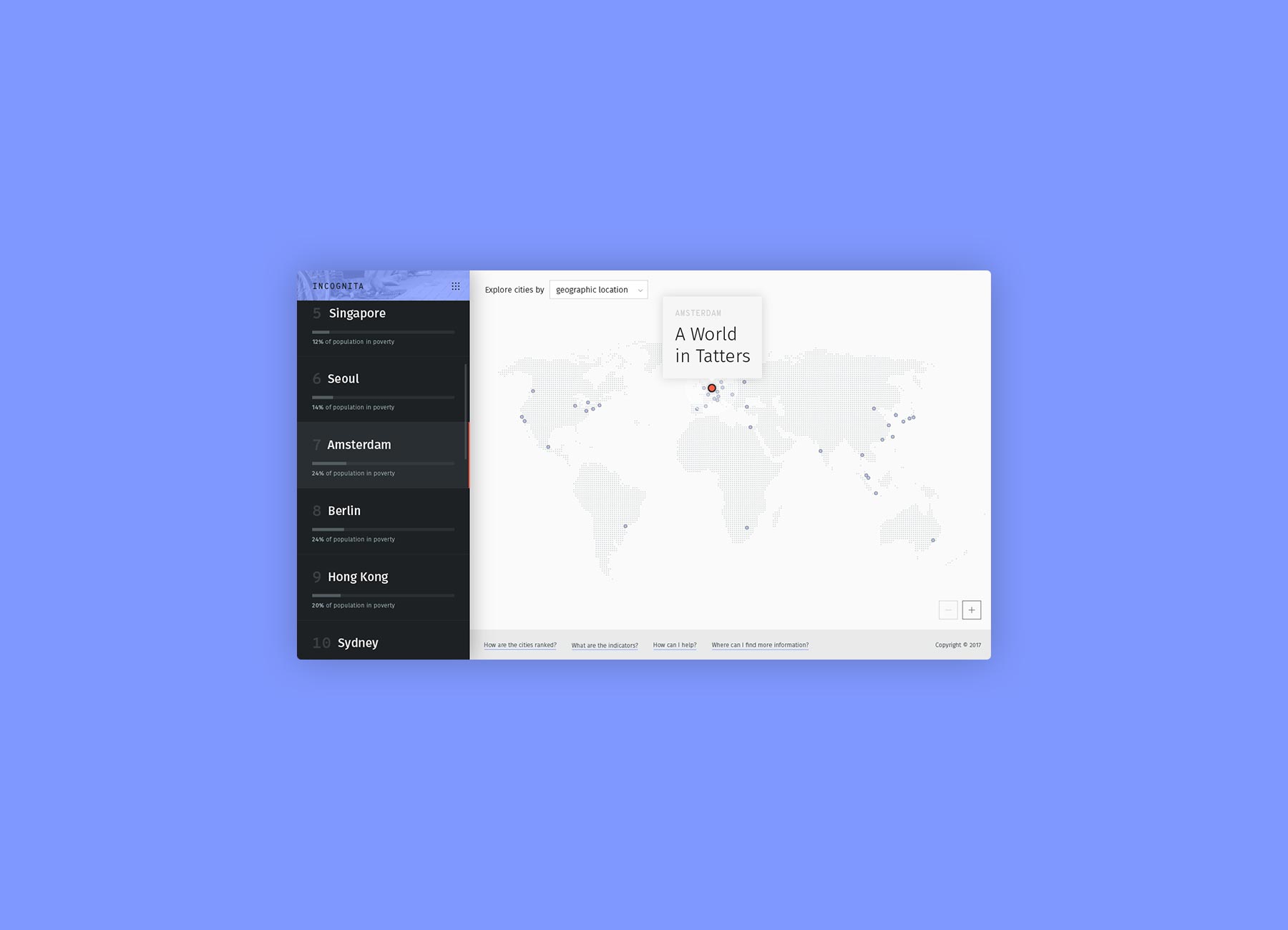
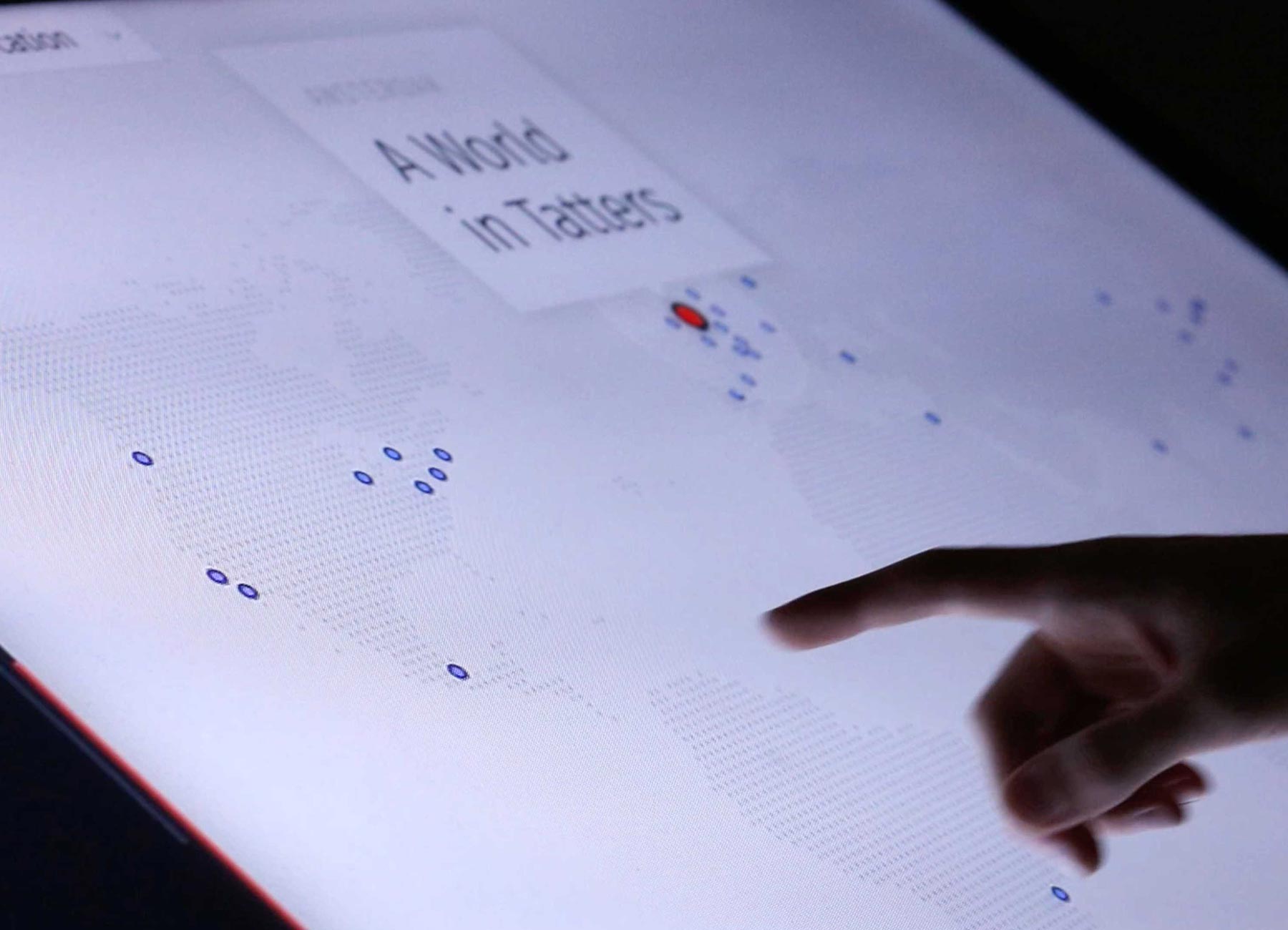
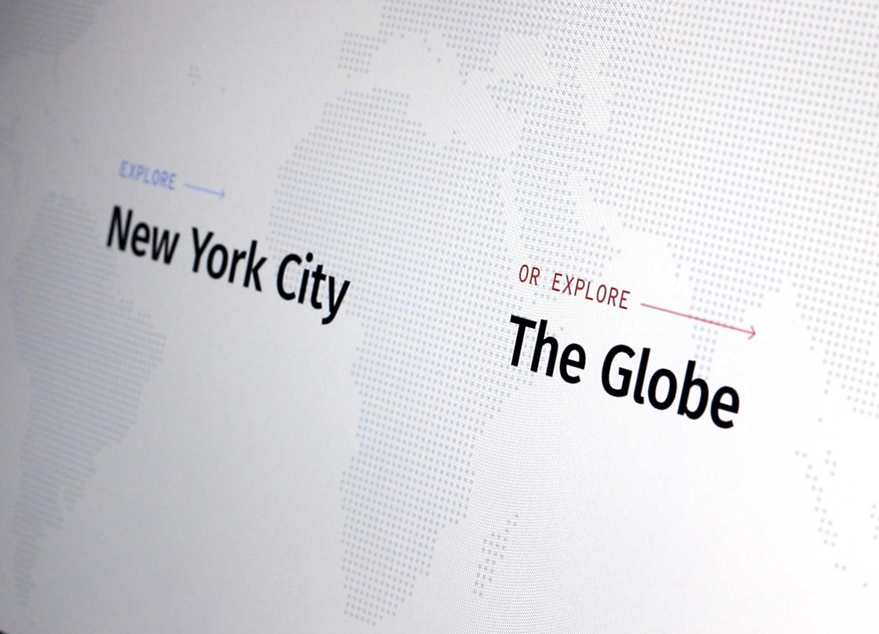
Locale Selection
The narratives of abject poverty are global. Incognita recognises your location and points you to the nearest major city and its case study, but also gives you a chance to explore the stories around the world.
Mapped Cities
Based on GPCI rankings, the top 40 major cities are pinpointed on a map, and react to user interaction through scroll and hover to help highlight place names and stories.

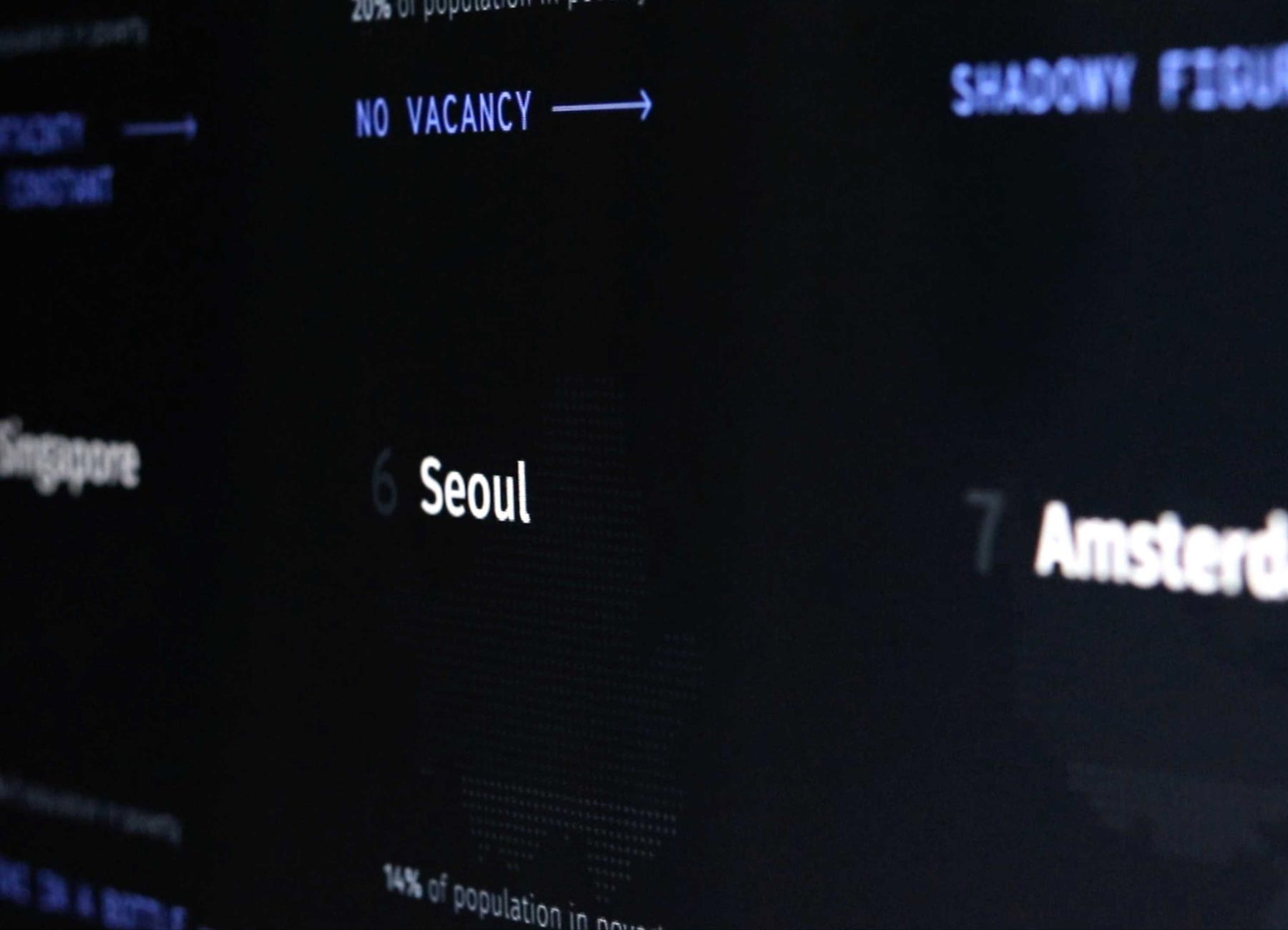
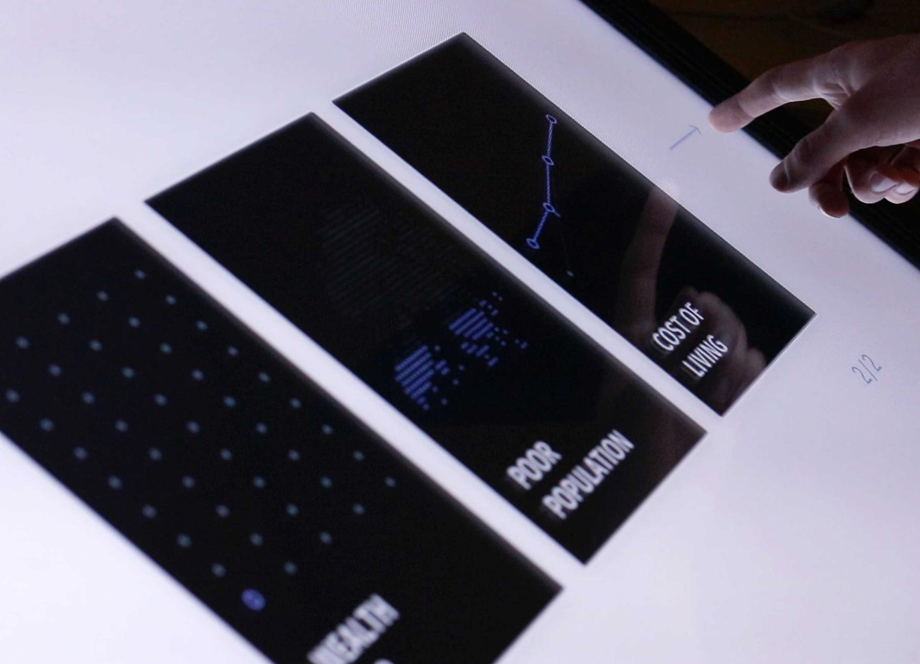
Grid View
Surfaces the percentage of the city in poverty and further highlights the story in the case study.
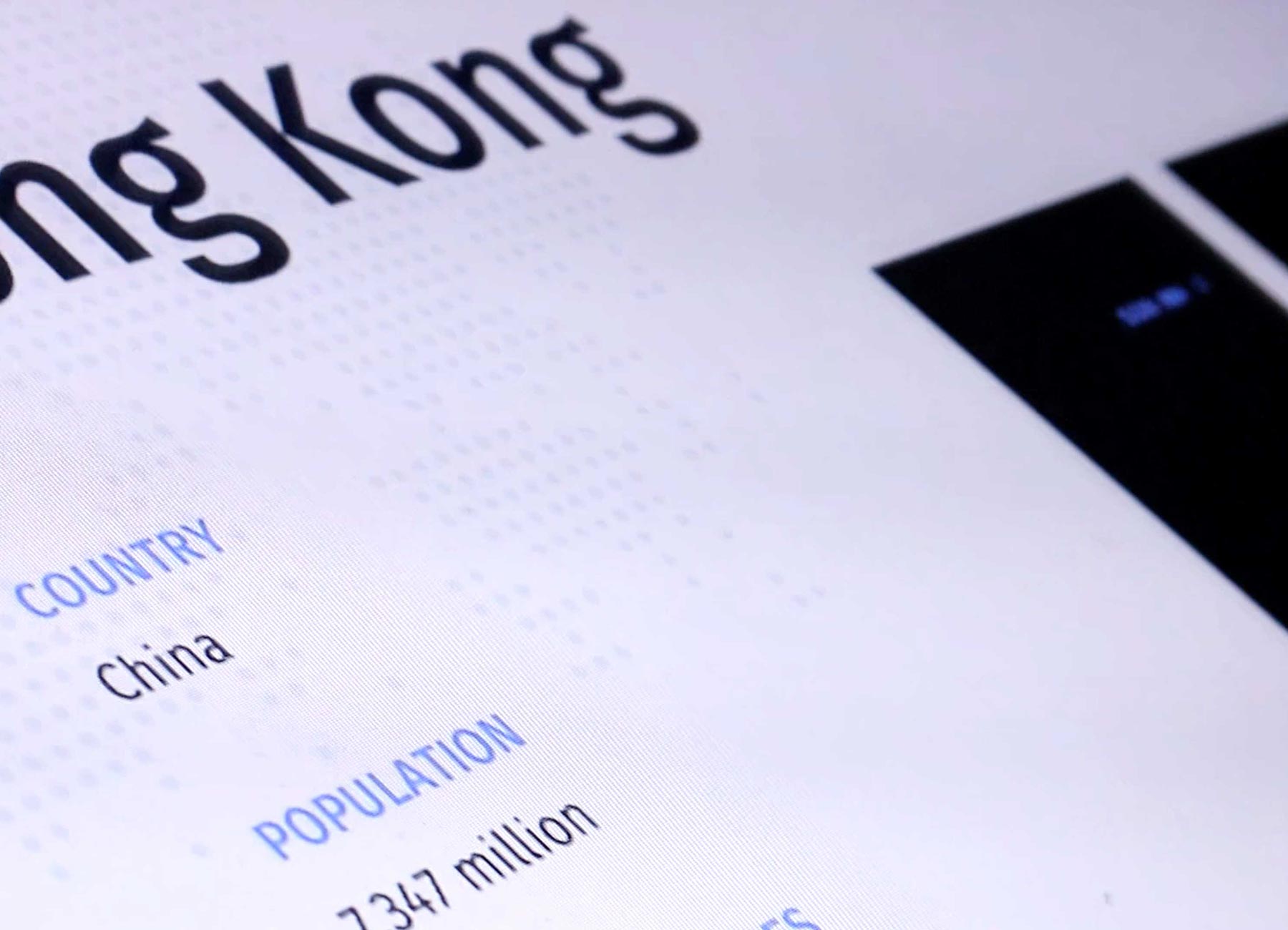
Contextual Data
Gives an objective look at quantifiable measures of the city’s wealth and relevant statistics.
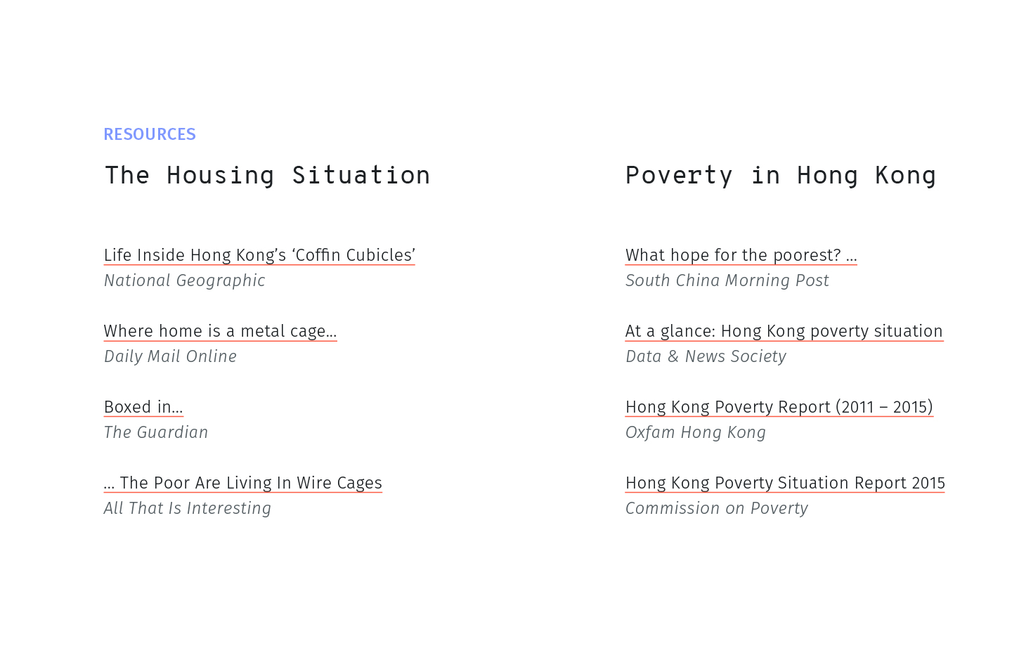
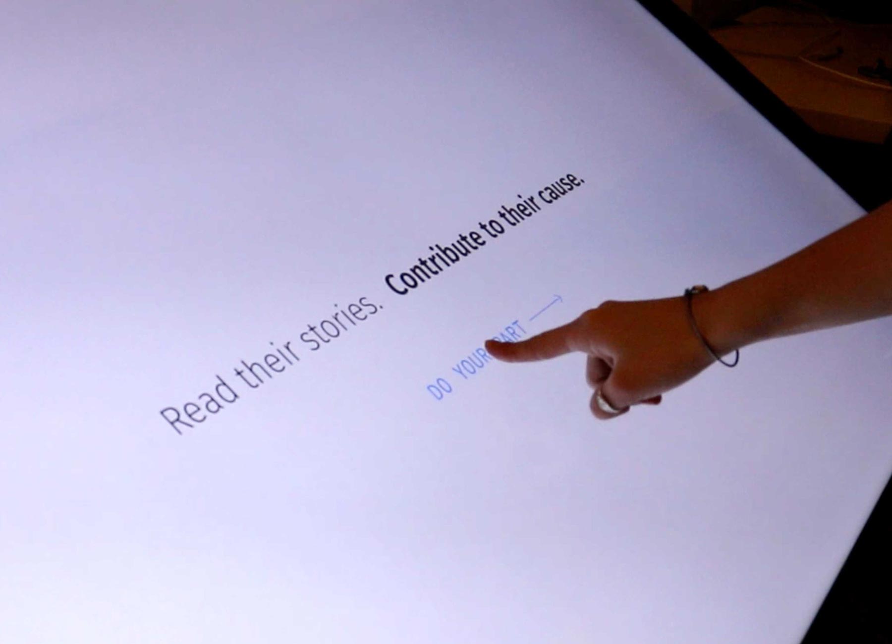
In-depth Narrative
Invisible poverty is a multifaceted phenomenon, and conveying an example through story is one way to look beyond numbers.
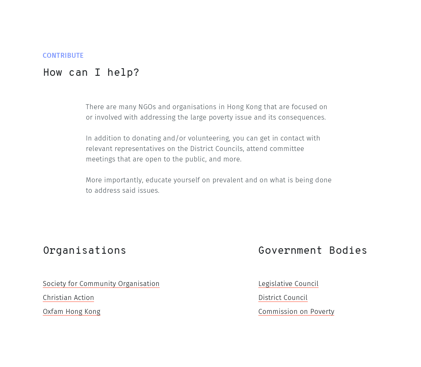
Call to Action
In addition to giving a baseline understanding for the cause, Incognita aims to raise awareness of existing efforts and opportunities for the user to contribute.
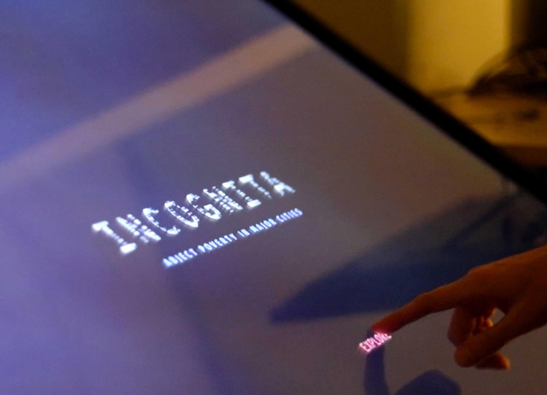
Prototype Gallery
Although these images are based on a large interactive touch screen, the experience is not limited to just this technology.

04 Fin
Incognita brings awareness to the extent of invisible abject poverty in global major cities. Through approaching the case studies through both objective and subjective lenses, the experience should be illuminating and engaging.
The themes presented in this project are dear to my heart, and in creating this experience, I hope I am able to communicate the importance of the devastation of abject poverty that is masked in affluent cities such as Hong Kong, and inspire further charitable action.
Through this project, I explored designing for a tone that is neither too sombre, nor too lighthearted. I was also able to flex my animation muscles and design microanimations that delight and that complement the data shown.
But wait – there's more!
Are you looking for a designer who hustles hard but stays humble? A curious soul who bobs her head to the Beatles and EDM? A foodie who will venture out for amazing cuisine with you?  If so, do get in touch!


© ETHELIA LUNG