ROLE Concept, Visual, Motion
DURATION May 2017
Instantaneous – that's what chat messenger interfaces offer.
For the generation that is accustomed to instant messaging, the immediacy of apps like WhatsApp, Messenger, and GroupMe is a norm. On the flipside, emails become sparse and snail mail much less so, and encountering situations where they must be sent induces anxiety.
01 Understanding
While we still utilise email, my peers have noted the following issues with its connotation –
[ return]
The ‘Enter’ key, typically used to send chat messages, gives the illusion that an email is about to be sent, whether or not the sender is ready
Writing
The language and tone associated with formal emails becomes lost, as chatspeak takes over our vocabulary
02 Approach
Putting the mail back into email.
Courier intends to ingrain email with cognitive feedback that enhances the permanence and finality of actions within the email space. The design gives complex ideas and simple interactions an intuitive interface.
Tangible Assocations
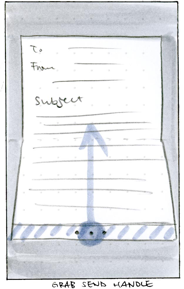
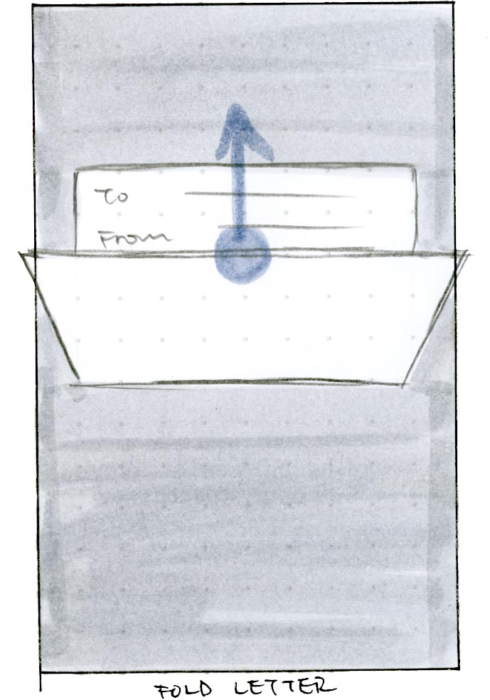
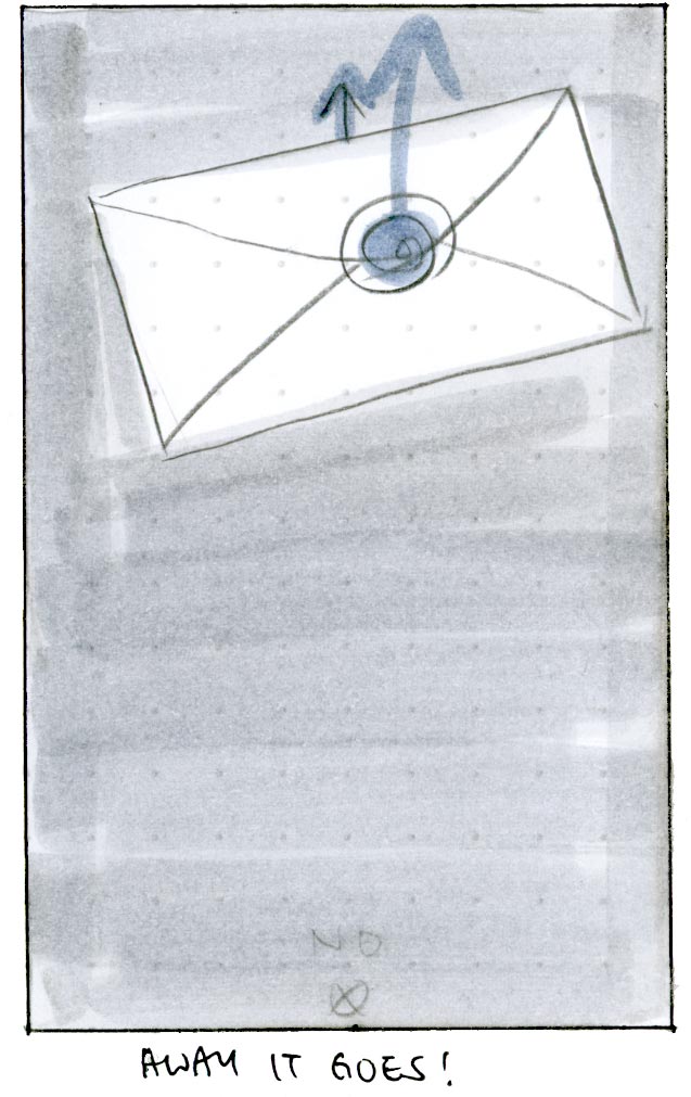
The process of sending physical mail used to be to write the letter, fold it up, place it in an envelope, stamp it, and send it off on its way.
We can associate electronic mail to these actions through simple gestures, specifically swipes to mimick the moving of digital letter papers to their destinations.
Rationale
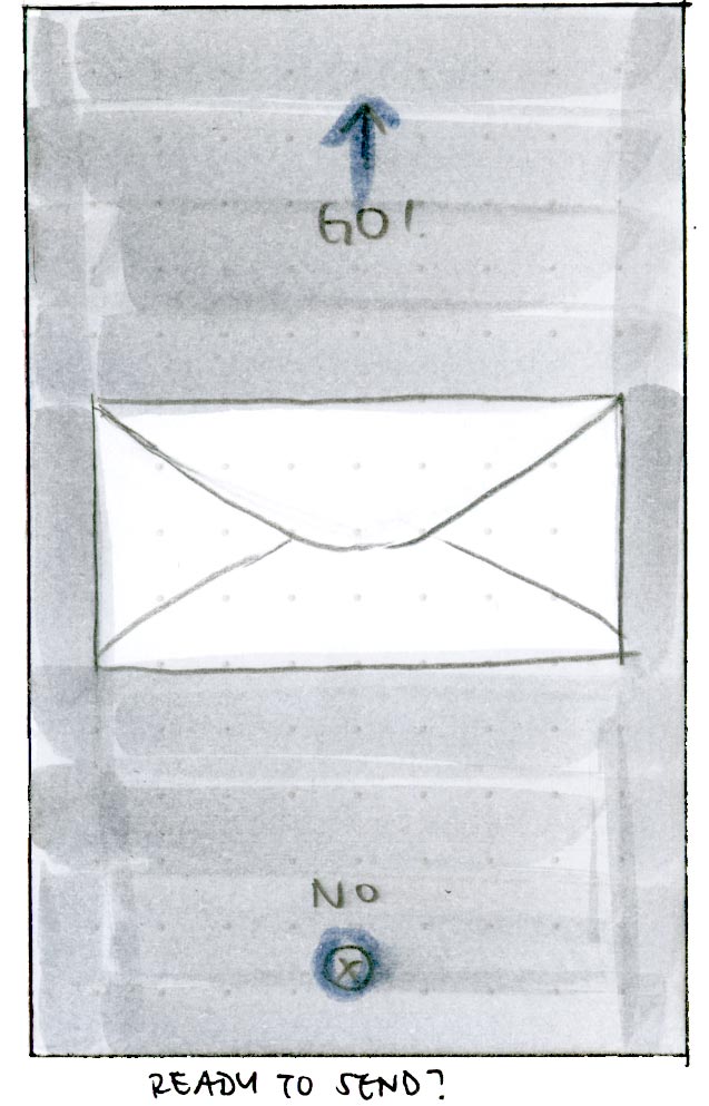
Courier intends to ingrain email with cognitive feedback that enhances the permanence and finality of actions within the email space. The solution intentionally slows the user down to some degree. There is a balance to be had between meaningful friction that encourages a layer of thought, and overwhelming friction that discourages the user from continuing.
03 Solution
Courier mimics but simplifies the actions of sending physical mail, making the user work a little harder, and think a little more, as they send their email. Courier nudges the user to consider the physical consequences of these actions, such as where letters come from and where they’re going.
Discovery
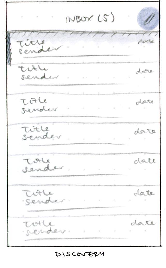
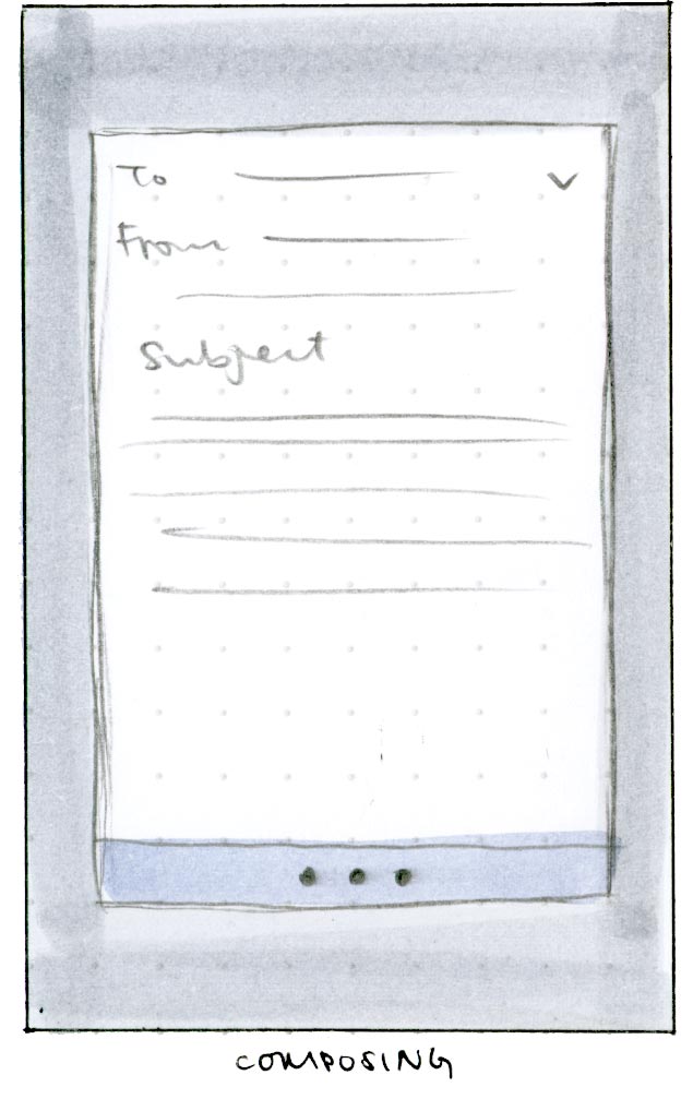
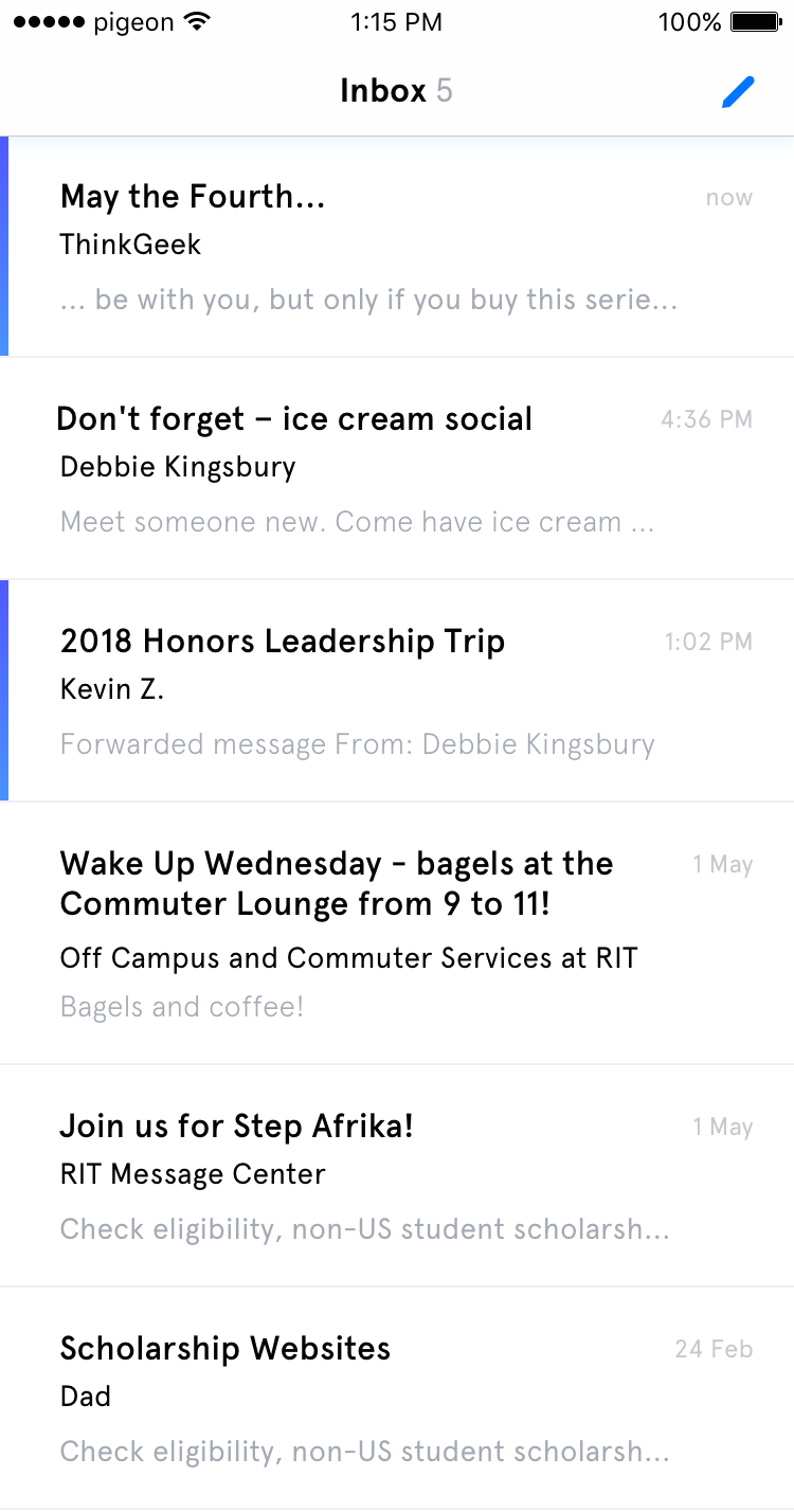
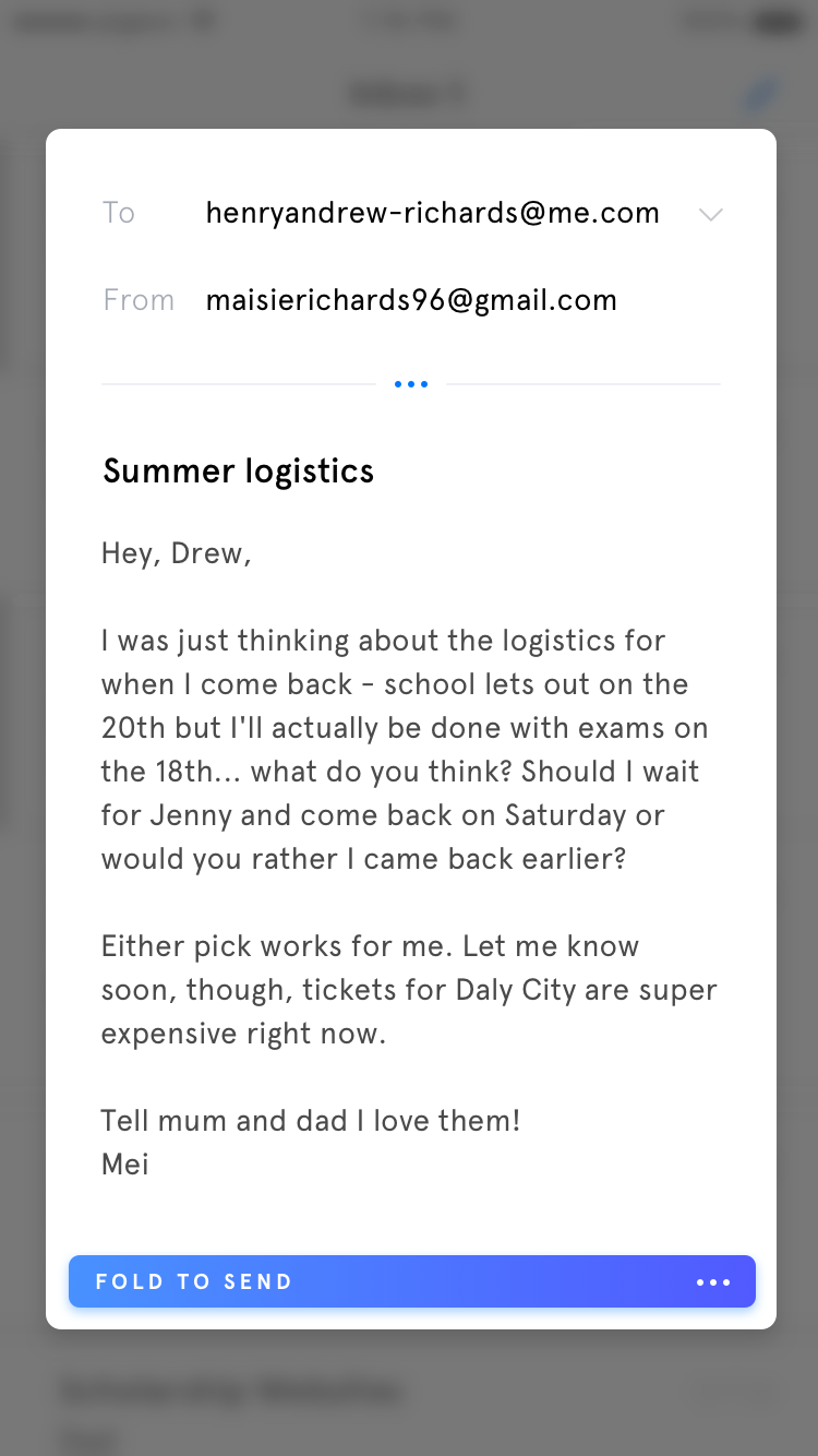
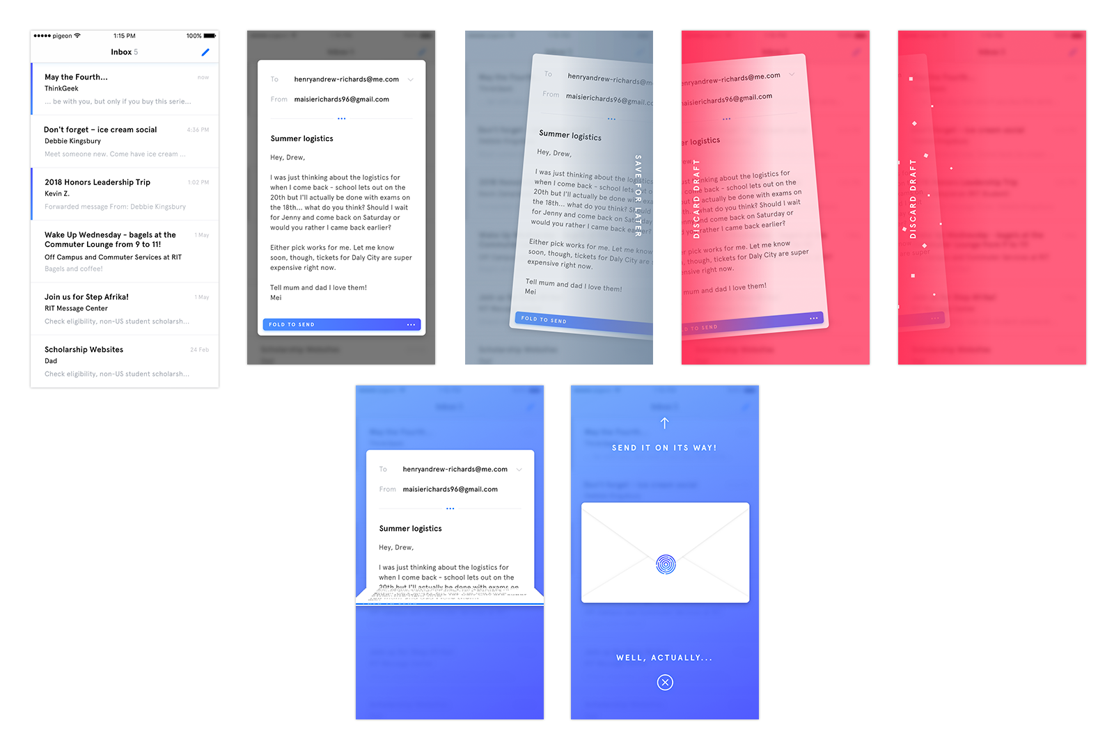
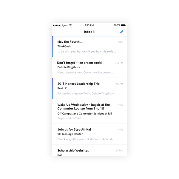
Papers slide up from the bottom of the screen to allow the user to start composing. The email list and compose screens set the stage, but are not as big a part of the interaction.




Drafting
Drafting mimics the interaction of moving a letter aside into a pile of drafts off-screen. The neutral cool grey tone signifies an action that is, albeit permanent, not destructive.
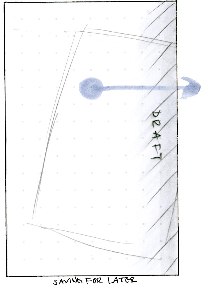

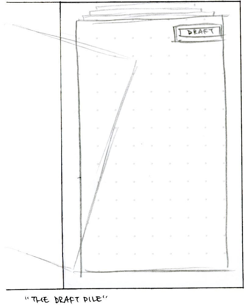

Discarding
Discarding mimics the interaction of feeding an unwanted letter through a shredder, with the illusion of permanence. The red of the screen forces the user to focus on the finality of their deletion.
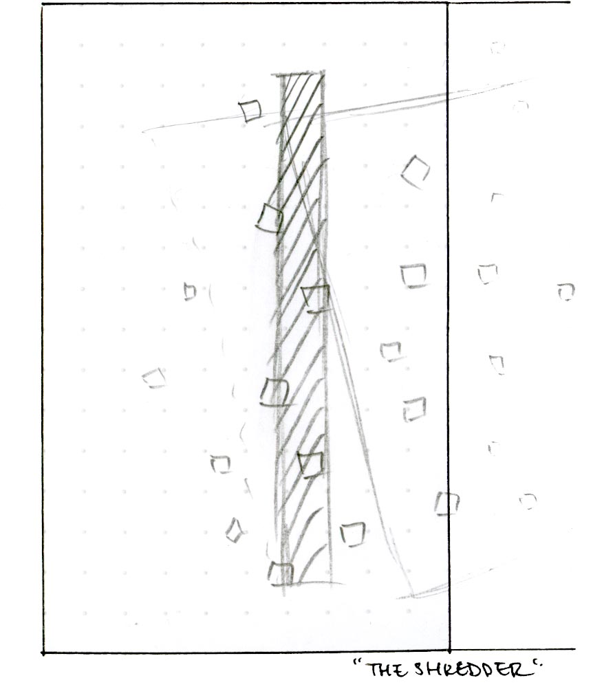

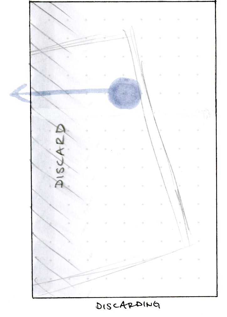

Sending
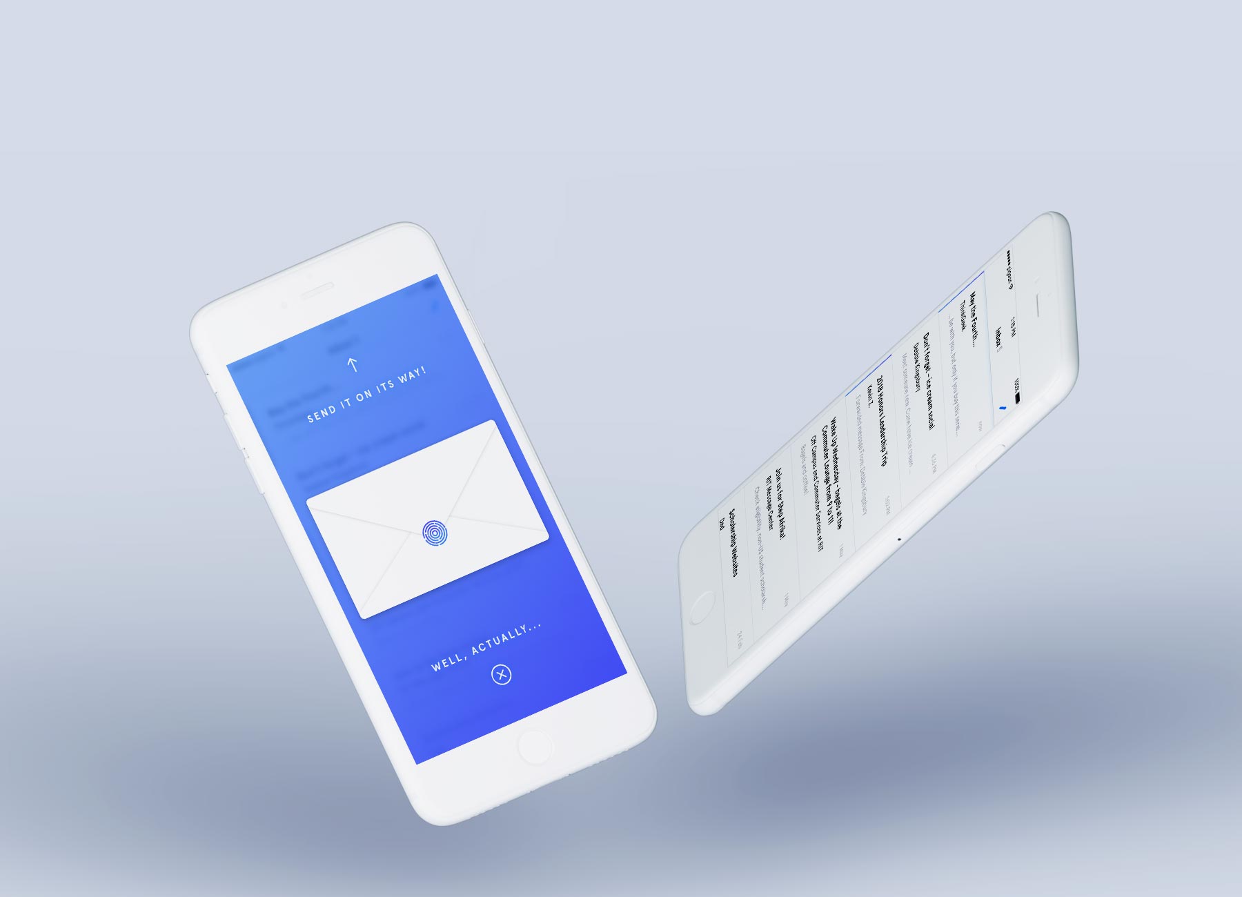
Sending mimics the folding up, packaging, and sending away of a letter, with two upward swipes. The double swipe to send is intentional friction to encourage the user to consider, again, the send action.





04 Fin
Courier brings tangible associations to emails, so that your email actions are more intentional.
This project was pitched as a very free form, rapid ideation and execution project. Despite not completing a fuller audit prior to designing, this was a good experience in bringing a quick concept to reality, from idea to visual comps to motion.


 If so, do get in touch!


