Grayscale
From intern to junior UX designer, my time at Grayscale gave me many opportunities to work on a whole host of projects. Below, you'll find a few selected works.
Interested in my thoughts on my experiences? I wrote a blog post all about it
Bottleshock
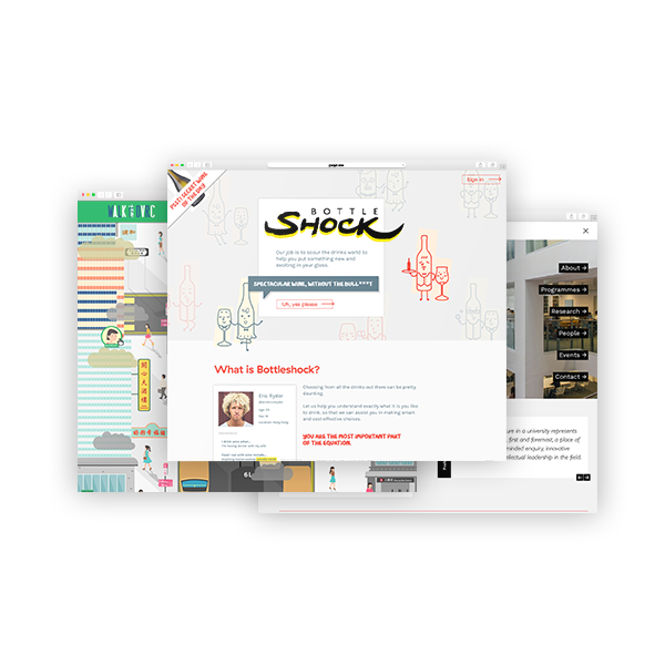
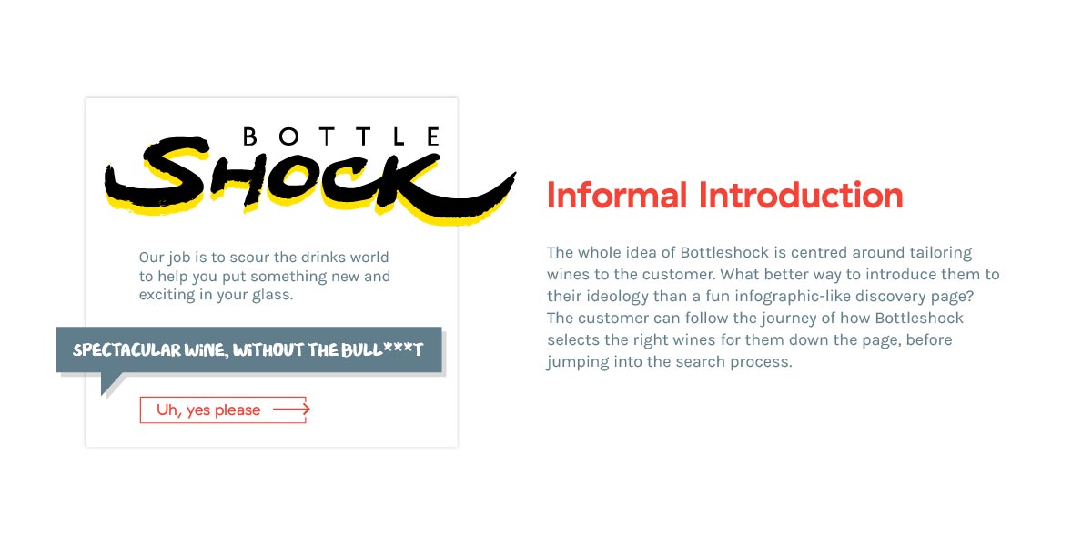
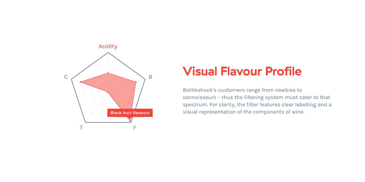
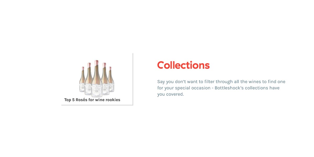
Not everyone is a wine connoisseur, but everyone wants to experience fine wines without the noise of pretentiousness. Bottleshock invites customers to engage in an exploration experience that tailors wines, to find the best wine for the individual.
CLIENT Bottleshock
ROLE Concept, Visual
DURATION June – July 2016
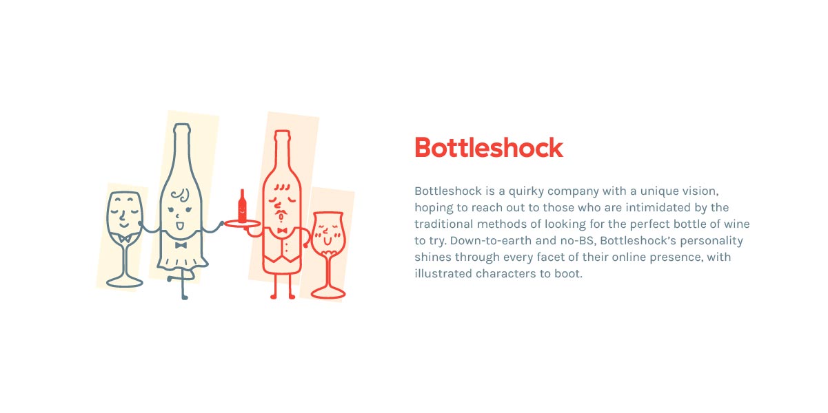
Bottleshock is a fun and informal service, and designing for them was likewise a great creative journey. From wireframing to visual design, I was given the creative liberty to spin a quirky take on a wine service that should stand out from the crowd with its personality.
(NB: All illustrations were created by a fellow designer.)
CUHK School of Architecture
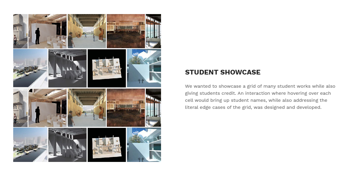
CUHK’s School of Architecture is a prestigious school looking to clearly and attractively showcase its campus, programmes, teaching, and research.
CLIENT CUHK
ROLE Concept, Visual
DURATION July 2016
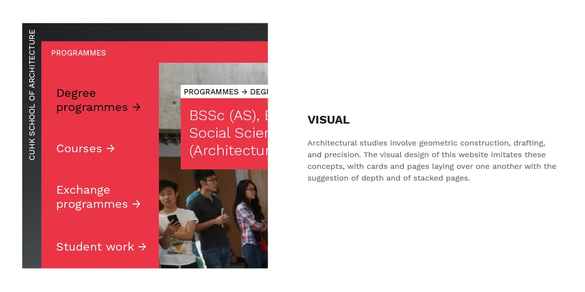
The Chinese University's School of Architecture is a school with a vision, and designing a modern presence for them meant making sure that vision was realised. I wireframed and concepted the layered structure of the pages, and applied styling with a chunky aesthetic meant to imitate sticky notes and modules. The presence gives CUHK SOA a clean-cut and up-to-date look and feel to match its reputation as a cutting edge school.
DVRC
DVRC is a pedestrianisation movement that wants to build an online presence to convey their message and motivate visitors to support their cause.
CLIENT CAN DVRC
ROLE Concept, Visual
DURATION June – July 2016
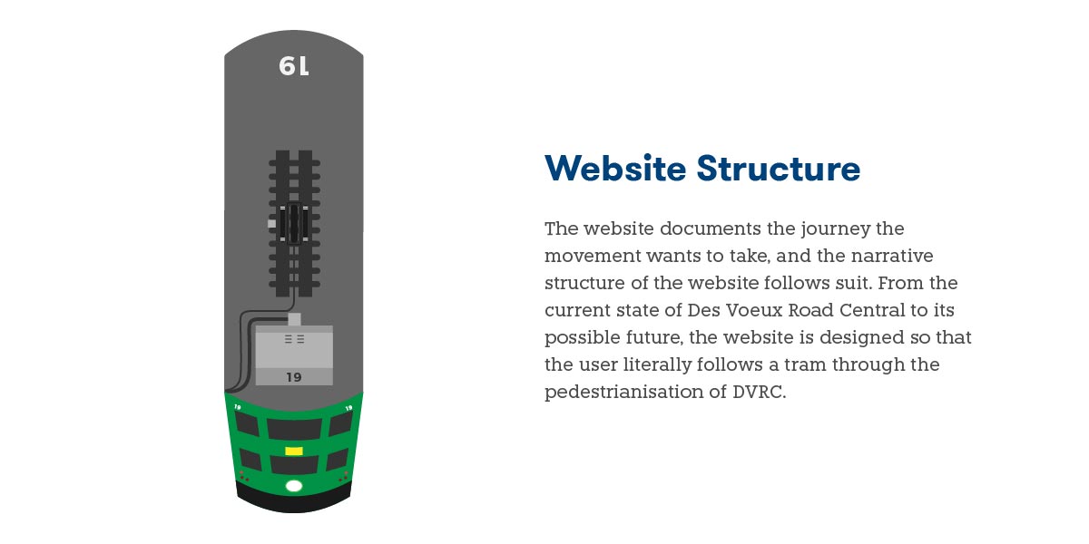
As a campaign, the DVRC pedestrianisation movement aims to educate and empower the people of Hong Kong to consider the health and safety issues of Des Voeux Road Central as it currently stands, and how such concerns can be addressed. To provide DVRC with an online presence that isn't dry but stays informative, I conceptualised the flow and structure of the website, which was to have users follow the journey of a tram from the current smoggy state of the road to the future green wonderland.




 If so, do get in touch!


